Theme Editor
This guide explains how to use the Theme Editor to set up colors, fonts, and custom styles for your app.
What is the Theme Editor?
The Theme Editor is a built-in tool in LiveCode Create that allows you to:
- Define a color palette for your app.
- Set global font styles and sizes for headings, body text, and captions.
- Apply themes automatically to widgets for consistent design.
By using themes, you save time and maintain visual consistency without manually styling each widget.
Accessing the Theme Editor
To access the Theme Editor:
- Open your project in LiveCode Create.
- Click on the Theme Editor Icon in the left-hand toolbar.
Key Features of the Theme Editor
1. Color Customization
The Theme Editor allows you to create and manage a color palette for your app.
Users can:
- Choose from pre-made default color palettes.
- Create their own Custom Color palettes.
Default Theme Colors
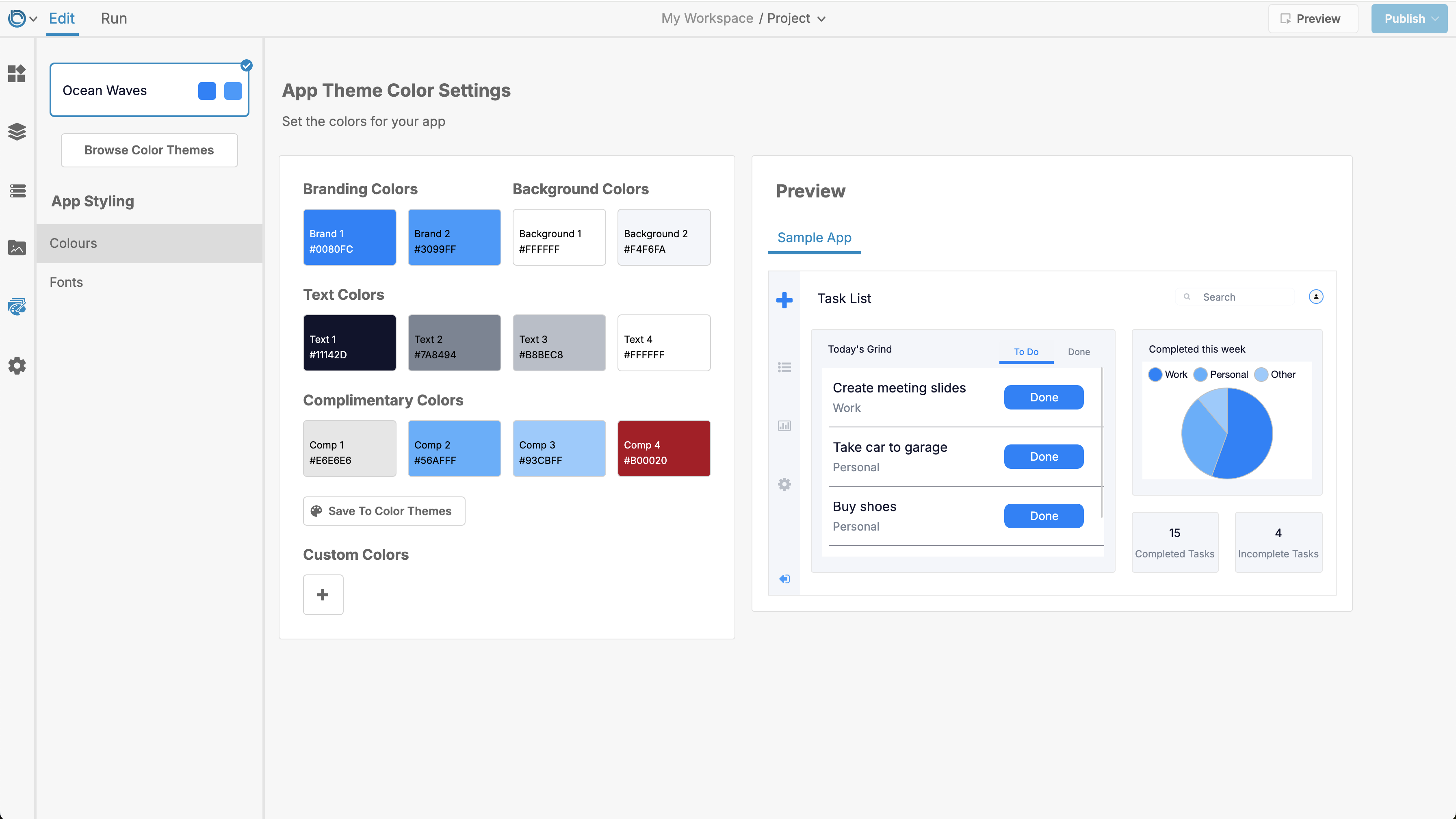
The theme colors are broken into the following groups:
Brand Colors
- Brand 1: The primary color of your app, used for accents across the app.
- Brand 2: A secondary color, used as an alternate accent color.
Background Colors
- Background 1: The main background color of the app.
- Background 2: Used for groups or widgets that appear on top of the primary background.
Text Colors
- Text 1: Used for main text, such as titles.
- Text 2: Used for supporting text, such as subheadings.
- Text 3: Used for non-Brand 1 icons.
- Text 4: Text that appears on top of the Brand 1 color.
Complimentary Colors
- Comp 1: Used for borders.
- Comp 2: A shade of Brand 1, often used for highlights.
- Comp 3: A shade of Brand 2, for highlighting alternate accents.
- Comp 4: A general-purpose color for additional styling needs.
You can adjust these colors using the color picker or by entering specific RGB or Hex values.
Example: The preview shows how the colors of the default "Ocean Waves" theme get applied to an applications widgets and layout

Custom Colors
In addition to the default theme colors, you can add Custom Colors in the Theme Editor.
- Custom Colors are static and do not change when the app's theme changes.
- They are useful for storing specific color values needed throughout your project.
Custom Colors can be:
- Added, edited, or deleted in the Theme Editor.
- Accessed via the color picker in the Property Inspector when styling widgets.
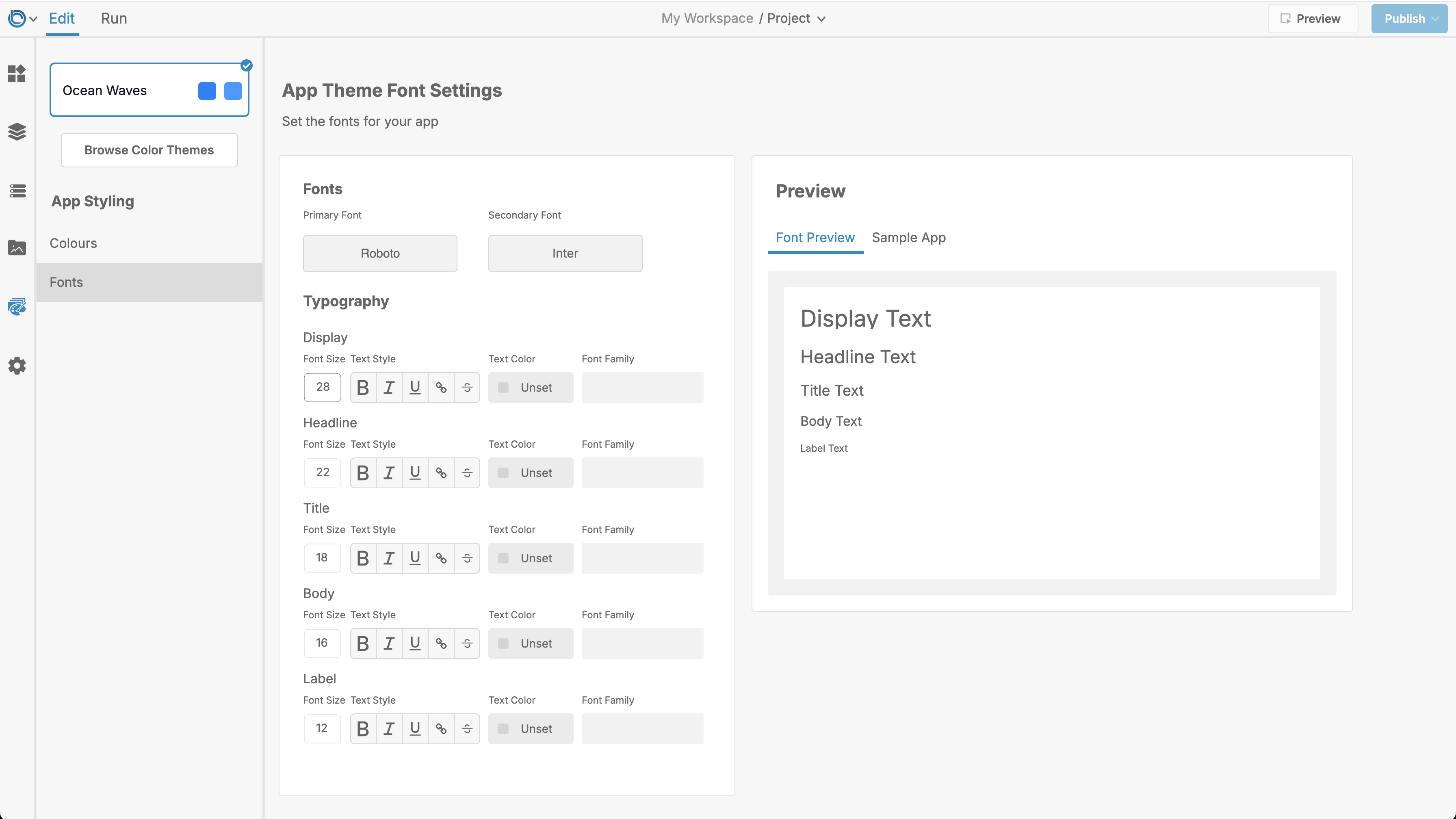
2. Font and Text Styles
The Theme Editor lets you define consistent fonts and text styles for your app.
Options include:
- Font Family: Choose a font that matches your app’s design.
- Font Size: Set sizes for headings, body text, and captions.
- Font Weight: Adjust text to be bold, regular, or light.
- Font Color: Ensure readability with appropriate text colors.

3. Applying the Theme
The styles you define in the Theme Editor can be applied to:
- Widgets: Buttons, Input Fields, Simple Lists, and more.
- Layouts: Background colors and text styles for entire screens.
Steps:
- Add a widget (e.g., a Button) to your layout.
- The widget will automatically inherit the theme’s global styles.
- You can adjust or override the theme styles for individual widgets using the Property Inspector.
How to Use the Theme Editor
Follow these steps to customize your app’s theme:
-
Define Your Colors:
- Adjust default colors for Brand, Background, Text, and Complimentary groups.
- Add Custom Colors if needed.
-
Set Font Styles:
- Choose a Font Family, set Font Sizes, and adjust Font Weights.
-
Preview Changes:
- View updates in real time directly in the Theme Editor Panel.
-
Apply the Theme:
- Add new widgets or layouts—they will inherit the defined theme automatically.
Tips for Using the Theme Editor
- Start Early: Set up your theme at the beginning of your project for consistency.
- Keep It Simple: Use 2–3 main colors for a clean, professional design.
- Stay Consistent: Use the same colors and fonts across all layouts.
Example: Creating a Theme
Here’s an example of a simple theme setup:
- Brand 1: Blue (0, 122, 255)
- Brand 2: Orange (255, 165, 0)
- Background 1: White
- Text 1: Dark Gray (50, 50, 50)
- Comp 1: Light Gray (200, 200, 200)
Font Styles:
- Headings: Roboto Bold, 18pt
- Body Text: Roboto Regular, 14pt

For further learning: